Our Favorite Comic Book Covers - Part Four
Posted on 8/6/2013
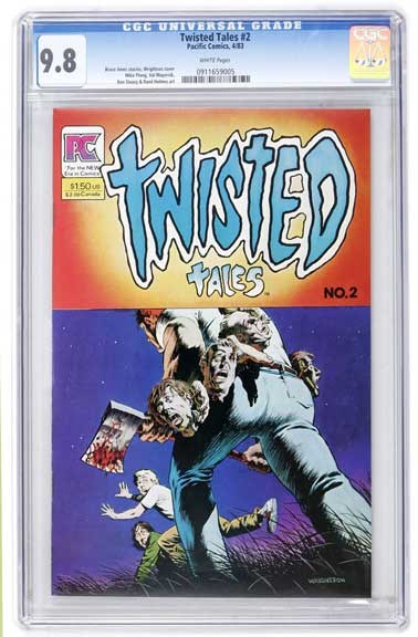
Twisted Tales #2
Twisted Tales #2 is another gloriously morbid Bernie Wrightson cover. Wrightson, being a seasoned master of horror comics, (e.g., Swamp Thing, House of Secrets) ups the ante with this horrific and slightly comedic "Ax-wielding killer with a human head belt." Wrightson's previous work showed excellent line work and detail, but the way this particular cover is illustrated with strong lighting techniques focuses on the faces of the victims. A decade after his work on Swamp Thing, Twisted Tales #2 shows Wrightson's aggressive evolution as an artist and keeps him on the map in the horror world.
Michael Balent, CGC Signature Series Coordinator
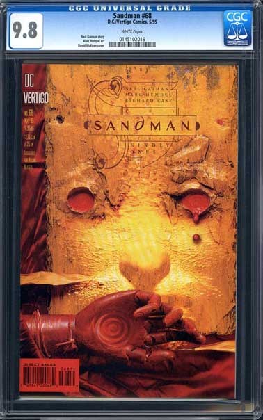
Sandman #68
Anything by multimedia artist Dave McKean is a masterpiece, and any cover of the entire run of Neil Gaiman's Sandman is worthy of mention, but issue #68 takes the win for me. The warm colors and textures Dave uses on this cover evoke the story within, the Greek tragedy that is The Kindly Ones arc. The bloody tear sums it up succinctly — the death of Morpheus, the death of Dream — and ties the entire story together in one image.
Eric Downton, CGC Customer Service Representative
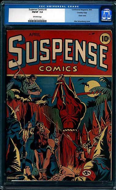
Suspense Comics #3
I chose Suspense Comics #3, by Alex Schomburg. A beautiful damsel in distress in the hands of, and at the mercy of, the dreaded Nazis. Firelight casting flickering shadows on hooded figures. On the brink of certain death, in what appears to be some sort of evil sacrifice, our hero arrives in the nick of time. But does he save the day or die at the hands of the villains' gun blasts? A great example of good vs. evil, wonderfully illustrated by a fantastic Golden Age artist.
Andrew Palmer, CGC Customer Service Representative
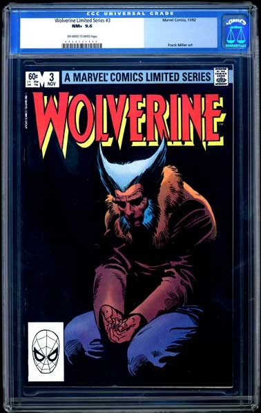
Wolverine Limited Series #3
In our modern age of macho hero, ultra-violent and pseudo-pornographic comic covers, we often lose sight of the fact that comics in themselves are one of the only true American art forms. While there are many great covers that span through the ages, one in particular has always stood out for me as more than a cover, but a work of true art. Wolverine Limited Series #3, drawn by Frank Miller and inked by Joe Rubinstein, is more than a typical cover. Miller's image of Logan sitting alone in the shadows shows us that he is a man with a tormented soul, with a lost past. I find the darkness creeping in around him representative of his uncertain future and the darkness growing inside of him. This simple image goes beyond just an image, giving Logan a soul and defining the character for years to come. Much like the masterworks of old, I feel this cover is worthy of being hung in any gallery.
Tyler Gingery, Quality Control
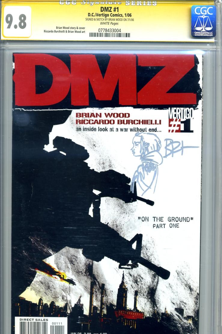
DMZ #1
This is a really tough one. Mainly because my favorite covers usually involve artwork that steps outside the box of the traditional comic style. Growing up in a graphic design shop, my tastes tend to lean more towards very design-oriented comic art. So it’s nice to see that so many great artists have emerged over the last decade who aren’t afraid to break new ground within comic art and go that direction.
Although most commonly known for being a writer, Brian Wood has a very lengthy and impressive history in graphic design, including time as a staff designer for Rockstar Games, working on Grand Theft Auto, Max Payne and Manhunt. All of which had incredibly unique and eye catching artwork. Being a huge fan of almost everything Wood’s name is on, his series DMZ is certainly my favorite.
Over the course of DMZ's 71-issue run, there were so many great uses of various design elements. From layered maps of Manhattan to bombs dropping, the covers always creatively depicted what was going on in the story without feeling like it was being spoon-fed to you. The entire series was exciting to me not only because of the awesome story and art inside, but also because of the design on the covers each month. I found myself anxiously looking forward to seeing the next cover each month.
Of all the DMZ covers, I'd have to say that #1 is probably my favorite. Brian Wood did an amazing job kicking off the series with this one. He captured the gritty urban reality of DMZ by using dirty and grungy design elements. I especially love the use of the limited black and white color palette with just the right amount of striking red spot color to draw your eye from the title directly down to the smoldering skyline. The scratchy stylized smoke pouring up from the city reminds me of something from some of Ashley Wood’s work. The huge silhouette of the troops hanging out of the side of a chopper, with their weapons trained on a target, seem to loom over the city. Even the crooked story arc title uses a typewriter-esque font which conjures the idea of a press reporter hastily typing up a story while still in the middle of it all. This cover really conveys the idea of a chaotic city under siege, where nothing and nobody is safe. It provided a great first impression of the fantastic story that was to follow.
Scott Davis, CGC Receiving/Shipping
We've enjoyed sharing some of our favorites with you. Maybe one of them was already on your list too — or maybe it is now.
Missed the previous articles in this series? Click here to read:
Part 1,
Part 2, and Part 3.
Stay Informed
Want news like this delivered to your inbox once a month? Subscribe to the free CGC eNewsletter today!