- Popular Post
-
When you click on links to various merchants on this site and make a purchase, this can result in this site earning a commission. Affiliate programs and affiliations include, but are not limited to, the eBay Partner Network.

PixelPusher
-
Posts
22 -
Joined
-
Last visited
Content Type
Forums
CGC Journals
Gallery
Events
Store
Posts posted by PixelPusher
-
-
On 1/28/2023 at 12:00 PM, Dr. Balls said:
I've come across artboards that are 1/4" over 11x17 and I trim them to 11x17. Some people take issue with that, and that's okay. To me, I'm not altering the image area and these aren't Picassos, so taking off 1/8" paper on either side isn't going to make any difference at all when it comes to the historical provenance of the artwork.
I have a Steve Mannion piece that is odd-sized, and I considered trimming it slightly to fit until I turned it over. He had some loose sketches and thoughts written down that really added to the uniqueness of it - and in that case, trimming would have cut off some of his writing, and I didn't want to do that, so I went up to a 12x18" frame.
And yes, I use photo corners to mount smaller pages to an 11x17 page in the frame, or I leave a gap at the top or bottom. Mainstays also makes a 12x18" frame of the same design, so if you have larger boards and don't/can't trim them, you can always step up a size, too.
The Mainstays have white and black paper in the package, which could be used as a 'spacer' of sorts if you have a smaller image. I would recommend getting some acid free paper and throwing out the paper in the Mainstays packaging, just to avoid any long-term yellowing from the board touching cheaply manufacturer packaging materials that may have higher acid/ph concentrations in them.
And also with that, the Mainstays frames are super cheap and have inexpensive glass. My office does not get any daylight, and the lights are on for maybe an hour every day (and they are all LED bulbs that emit very little UV) - I don't worry too much about light exposure to the art. I maintain the humidity level in my basement (with de-humidifiers) to 40-50% relative humidity (as recommended by LOC) since that is where my paper collectibles are all stored.
My biggest goal was to have nearly all of my art as "wall art", and buying custom framing for 40 pieces of art was not going to happen - so these mainstays were a perfect solution.
Thanks again for the thoughtful responses. My frames arrive today and I can't wait to try them out. The 12x18 size might be perfect for my slightly larger than 11x17 boards. Everything you said about the backing paper makes sense. I did invest in a quality Rototrim paper cutter so I can trim some acid free paper to size.
-
On 1/27/2023 at 1:18 PM, Dr. Balls said:
Absolutely! I use the Mainstays frames from Wal-Mart. A couple tips about the frames...
Thanks for the super informative reply! I saw these exact frames before and they were very tempting. Good to know that they come highly recommended. The cardboard spacer between frames is very clever.
How are you positioning the art when it's not quote 11x17? I spy some little black corner supports and a black background.
Do you ever have to trim the art ever-so-slightly to fit it in the frame ? This is something I imagine I will run into and I'm torn.
-
On 12/7/2022 at 8:51 AM, Dr. Balls said:
Got my art wall finished, and I'm officially out of wall space in my office.

I love the uniform look you were able to achieve. Can you share what you're using for the frames or are they custom?
-
I always wondered about this... when you go to a dealer's booth at a con, you see plenty of high end OA in toploaders. It seems like the most expensive pieces. Are the dealers really moving art from Itoyas to toploaders and back to Itoyas for every show? That seems like a lot of touches on the art because it can be a bit fussy inserting and taking out art from a toploader. Or are dealers keeping these pieces in toploaders year round?
-
On 11/22/2022 at 4:00 PM, Lago32 said:
I had the HP Officejet Pro 7740 for about 5 years and after about 3-4 years it started wearing out so I took the opportunity to buy the EPSON Workforce WF-7840 a year or so ago, and frankly I like it much better...
I plan to do the same. I've had the HP 7740 since 2018, but I will switch to the EPSON Workforce at some point. My main issue with the HP is that it struggles with printing on thicker paper (like a typical comic art board). The Epson seems to handle thicker boards much better and I see it being a common choice for professional inkers who need to print out blue lines. The HP software has also become very annoying with requiring a login and being buggy on MacOS. When it comes to printing, HP also introduced expiration dates on printer cartridges. It's very annoying that some perfectly fine ink cartridges aren't able to be used because it has been deemed expired. This stuff isn't cheap. I'm hoping Epson hasn't gone this route but I haven't looked into it yet.
I also bought a Professional Edition license for VueScan and it has been great for scanning.
-
I sold my first OA ever at this past ComicArtLive (woohoo!). One of the orders had to go to Germany and the purchaser initially requested Fedex. I've received plenty of dinged up and poorly packaged art so I wanted to make sure I used something legit for my first international sale. I used a great cardboard mailer I had saved from Cadence which was 18x12x1 and the weight came out to 1.5lbs. I brought it to an official Fedex shipping location and their cheapest option was $170 (~7 days to deliver) from California to Germany. Wow! I was really shocked at this. I asked what was the main driver for the cost and they said it wasn't the value I declared. They couldn't tell me much else except it'd be a little cheaper if I had an existing account with them.
I then checked out ShipStation via Paypal and got plenty of reasonable quotes in the $50-$70 range, including multiple 3 day options for UPS.
Can anyone explain why Fedex prices are over $100 the competition with a longer delivery time? Has anyone else experienced this?
-
-
For the Batgirl jam, middle left looks like older stylized signature of Marcus To (https://www.comicartfans.com/GalleryPiece.asp?Piece=1249022) and the middle right looks like Dean Kotz (https://www.instagram.com/deankotz/). Both are style matches as well.
-
- Popular Post
- Popular Post
I love seeing all the friendly discussion about how to best approach the layout!
For the curious, I'll expand on my printer search journey. As you can imagine, finding a printer for this type of project is like finding that needle in the haystack. There are some factors that make this challenging: The extremely low quantity and the oversize 11" x 17" hardcover format. I started by requesting quotes from offset and digital printers I've worked with in the past and seeking recommendations. It was apparent that my low quantity would not make financial sense for them to take this project on. In addition, very few could handle both the printing and the hardcover binding. Even fewer could handle the hardcover binding at the 11" x 17" size. I then looked into the online "photo book" offerings out there which are popular for wedding and family keepsake albums. There are some beautiful options out there (including lay flat pages which would be ideal for the amount of double page spreads I had), but no one was doing anything over 12" and the cover wasn't always customizable. Page count was also limiting and these websites also pushed you towards using their online page builder and I just wanted to hand off a PDF formatted to their specs. I eventually came across the winning printer and took a gamble. They specialized in academic publishing so I had no clue how my color heavy pages would hold up. I was so happy with the result that I began planning out a book for next year.
Putting the book together was such an enjoyable process. I found new love for art that I had put aside and pairing images together in spreads gave pieces a whole new meaning.
- Twanj, vodou, cloud cloddie and 7 others
-
 10
10
-
14 hours ago, JadeGiant said:
Awesome idea! Looks great!
A similar book for your Bob Larkin tributes would be awesome!
-
2 hours ago, vodou said:
Now the crit: in layout design it's more traditional (for good reason) to place your lesser image on the right (for the flip through draw) and your related better (or more finished/inked/bolder) image on the left side - to hold the viewer's time/interest for the long contemplation and back 'n forth comparison. Now there is the traditional way of doing things and then there's breaking walls and doing things differently to see if that works too...all good, just putting it out there and my lean is the more traditional/conservative approach. YMMV
")
Thanks! I appreciate the insight and that's one thing I went back and forth on.
-
On 12/23/2020 at 8:52 PM, eewwnuk said:
Can you share who you used for printing? This came out great!
I was lucky to find a place that was more of a turnkey process with a few printing options. You provide the PDF formatted to their specs and they do the rest. I felt the price was fair (especially considering my quantity) and I was pleasantly surprised by the overall quality. Currently trying another print job with them and hoping it turns out just as nice.
- Bill C and aardvark88
-
2
-
- Popular Post
- Popular Post
1 hour ago, Will_K said:Great idea !! And I think it's also a way of making a contribution to the actual commissions. Like when you pick out mattes and frames. It's a way of adding to the art.
If you can, can you give us a rough idea of the cost for printing a one-off like that ?? And that also misses the cost of having a professional layout and design the book.
Exactly! I love how this gives the commissions another life and I found arranging the pages took on an unexpected bit of storytelling consideration.
Pricing came out to ~$150 for 1 copy and shipping. Prep and design was about a week of my time. -
- Popular Post
- Popular Post
Since 2018, I've been collecting mainly 90's era Wildstorm commissions as it's a very nostalgic time for me. As much as I love original covers and interiors from that time, I quickly found myself priced out of the original art game. It's been a blast seeking out artists and seeing their interpretations of the characters. For the penciled commissions, I'll usually get them inked and digitally colored so I can make prints for myself or a poster to put on my wall.
A few months back I decided to design and print a book to showcase my favorite commissions over the years. The oversize format of IDW Artist Edition books immediately came to mind and I was able to find a printer who would produce a one-off book that met the specifications. It was a great feeling combining my graphic design know-how with my love of comic art.
Luckily, I got in the habit of scanning commissions as they arrived over the years. Everything had been scanned at 600 or 1200 DPI and catalogued for backup purposes. This made the process more streamlined as I assembled the different spreads and determined the order of the book. Everything came together in InDesign and after a few back and forths with the printer (like adjusting the width of the spine to accommodate the pages), it was off to be printed!
It arrived about 2 weeks later and I was really impressed with overall quality. The oversize format and full bleed throughout showcases the art in the best way possible. I find that I look at and appreciate my commissions more now since I have them in book format. It's easy to just grab it off the shelf and flip through.
If you're reading this and interested in creating something like this for yourself from your collection, please feel free to reach out! I'll help in any way I can and offer advice.
Design notes:
Cover: 11.25 x 17.25 Hardcover, Full Color, Full Bleed
Interior: 11 x 17, Full Color, Full Bleed, 156 pages
Scanner: HP OfficeJet Pro 7740
Production: Images edited in Photoshop, Book Assembled in InDesignView more images here: https://imgur.com/a/xo4zdUf


- Rick2you2, adamstrange, Catwoman_Fan and 29 others
-
27
-
 5
5
-
On 12/9/2020 at 1:41 PM, Carlo M said:
So net net a good experiece. The two pieces look very slick, with (obviously) thick blacks and nice effects. I love the simplicity and sophistication of Russell's art and I am glad I have a couple of examples. The fact they are printed on Marvel paper helps. Russell added one little sketch of Storm on a post-it on each of the pieces, which is nice. All the nice looking pieces from this and the previous issue have sold, so obviously there is demand for this kind of product. Not sure if this means that there will be a market for re-sale. In any case, at these price points (300 and 600 respectively) for this kind of quality I might buy again in the future, but I will be highly selective.
Thanks for sharing the experience. One thing I'm curious about is the Marvel paper. Is there a way to tell if it is actually pre-printed boards sent from Marvel and was it advertised to you that way? I ask because I've seen instances where digital artists will print out the official-looking blueline on the blank bristol board along with their digital pencils or inks. The way the second page art is perfectly within the outer blue border would be tough to get so exact if it was a pre-printed board.
-
On 9/11/2020 at 1:03 PM, Blastaar said:
I was able to get some feedback on types of blue line and the process itself from the great Sean Parsons!...
Thanks for sharing this fantastic insight. I love this thread! It's not often talked about, but the blueline process introduces a lot of variability. Here's what comes to mind:
- The scan of the original pencils (or digital)
- The cleanup of pencils by the inker
- The specific opacity and blue value by the inker sent to print, and how the printer actually interprets these
- The quality of printer the inker has. Some inkers send their prints off to a local printer for a higher quality and consistency.
- The printer ink levels and print quality settings
- The type of paper the inker has at their disposal. Some 11x17 printers can't handle thicker boards. Some inkers print the blue pencils and blue page lines on the back of "official" company boards. From what I've seen, very few print on the front side with the existing blueline due to alignment issues with a printer. Please correct me if I'm wrong.
It was nice that the traditional pencil and ink method simplified things quite a bit, because it was typically on an official company board.
-
On 9/8/2020 at 2:53 PM, Rick2you2 said:
How NOT to mail art (inks by Victor Cifuentes, very nicely done, by the way).
Any idea how long this will take to flatten out under a reasonably heavy Banker's Box?

Oh no, that poster tube is pretty narrow, but at least it looks like they rolled the paper the correct way for minimal overlaps. I'm personally OK with the larger heavy duty poster tube sizes (like Mondo) if the shipper doesn't feel confident in shipping it flat. Especially if it's international. It just requires more up legwork from the shipper though, because they don't typically sell the heavy duty shipping tubes from the post office from what I've seen.
When I have to flatten, I would probably not have them in toploaders so the paper can receive more direct pressure. I'd use a larger sheet of paper as a buffer and create 4 stacks of heavy books,one for each corner. I'm glad to see they are flattening out though!
-
On 9/3/2020 at 12:33 PM, Latverian Tourism Board said:
I learned when I picked up a cover of his that Nick Bradshaw’s process is much the same. Loose “pencils” on a computer, then he prints it out in a faint red, and finishes with pencil and ink to find the final lines and add an insane amount of detail.
I wonder if that is the method for a lot of new comic artists nowadays?
This is something I've encountered as well. Sometimes I wonder if this is something that should be disclosed, just as inks on blueline printouts typically are when done by separate artists.
- Does it matter less if it is the same person doing the digital pencils, printing them out and then finishing it traditionally?
- Does it only matter if the digital pencils are visible on the finished product?
- Would this information deter people from buying the art?
- Do artists feel weird about disclosing these intricacies of their process?
I'd love to hear opinions on this and if it changes for original art or commissioned art.
As the buyer, I wouldn't mind knowing if the pencils were actually done on the board or printed on. If I'm commissioning someone and it is more on the collaborative side, this is something I tend to ask because I've received some finished works with very rough and visible (dark) digital pencils printed out and then inked over. It seems like these roughs were done at a smaller size and blown up to fill the page when printed out. For me, it distracts from the piece. I'm sure I also have some artwork that has digital pencils printed out and I don't even realize it. I've also had a pencil commission that consisted of rough digital pencils printed out and then finished with tight pencils on top. I had no clue that was their process or even a thing, but I've learned that it's generally not my preference when I can see the digital pencils.
If i'm commissioning an artist for an inked piece, these are my preferences in order:
- Traditional graphite pencil and ink
- Traditional blue (or red, green, etc) pencil and ink
- Lightboxed traditional inks
- Very tight pencils printed out (preferably in the lightest grey possible) and traditional ink
- Rough pencils printed out and traditional ink
-
- Popular Post
- Popular Post
Daniel Warren Johnson blew me away with his take on my Scott Pilgrim commission request. He really is something special and it's been a joy learning more about him and his process on his YouTube channel.


-
Recent addition to the commission collection by Mario Chavez (https://www.instagram.com/m.chavezart/). Detail shots of the metallic ink over at CAF: https://www.comicartfans.com/GalleryPiece.asp?Piece=1585991
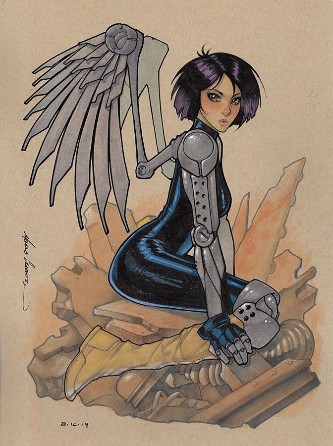
- BCarter27 and celluloidbuff
-
2
-
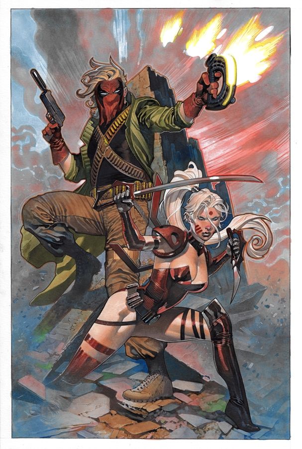
Just before SDCC, this amazing Grifter and Zealot commission arrived from Chris Stevens via Felix! I adore his tight line art, but decided to go for my first painted commission. To me, it's perfection.
CAF Link: https://www.comicartfans.com/gallerypiece.asp?piece=1568103


Comunication problem with Cadence Comic Art
in Original Comic Art
Posted
I was curious about the artists leaving, so I did a comparison of their website's artist navigation between January 19th and today (February 2nd). I don't know how accurate this is, but I thought it was interesting enough to share.